Caliper Sans
A measured, functional face.

/ About the project
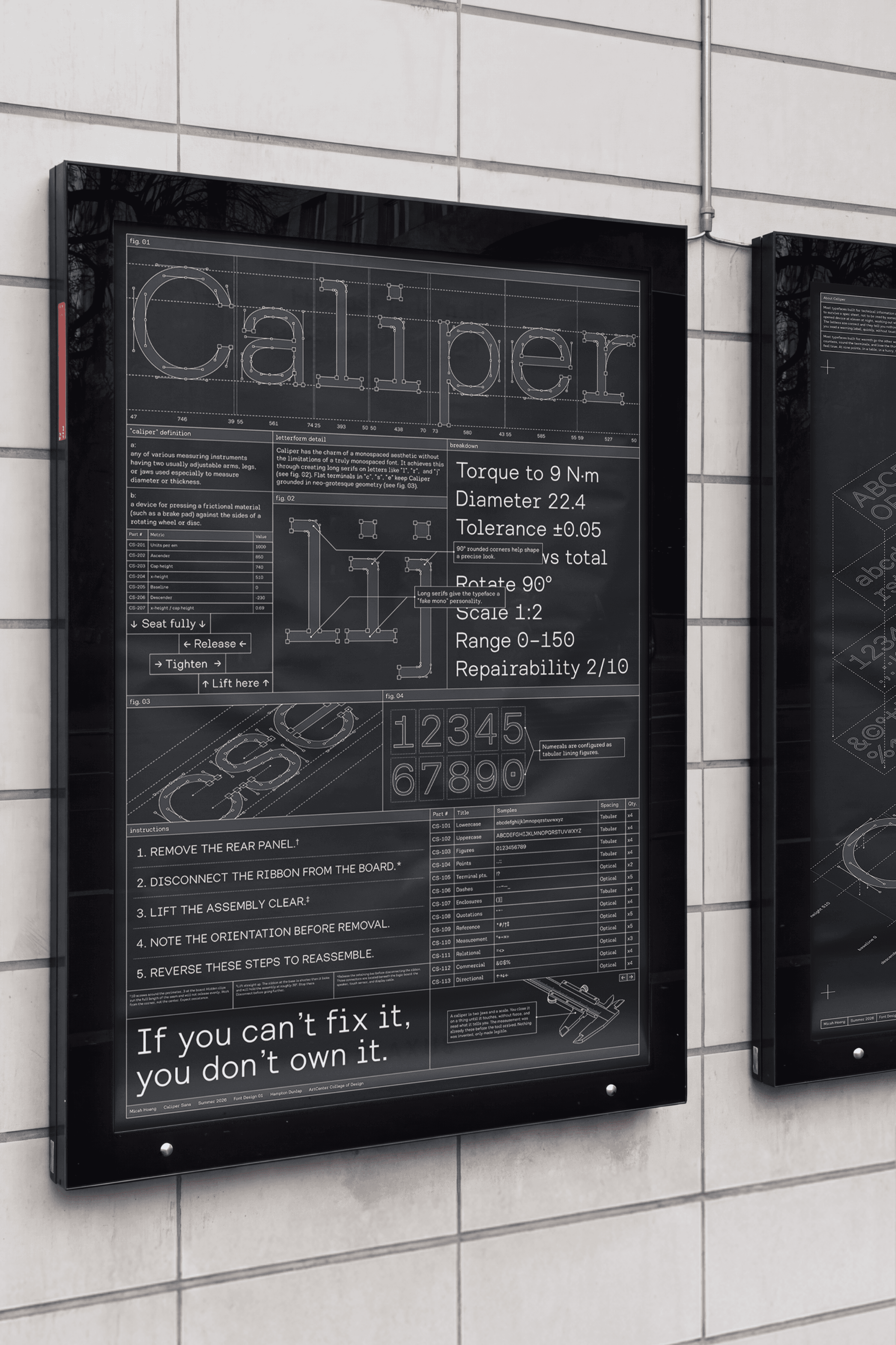
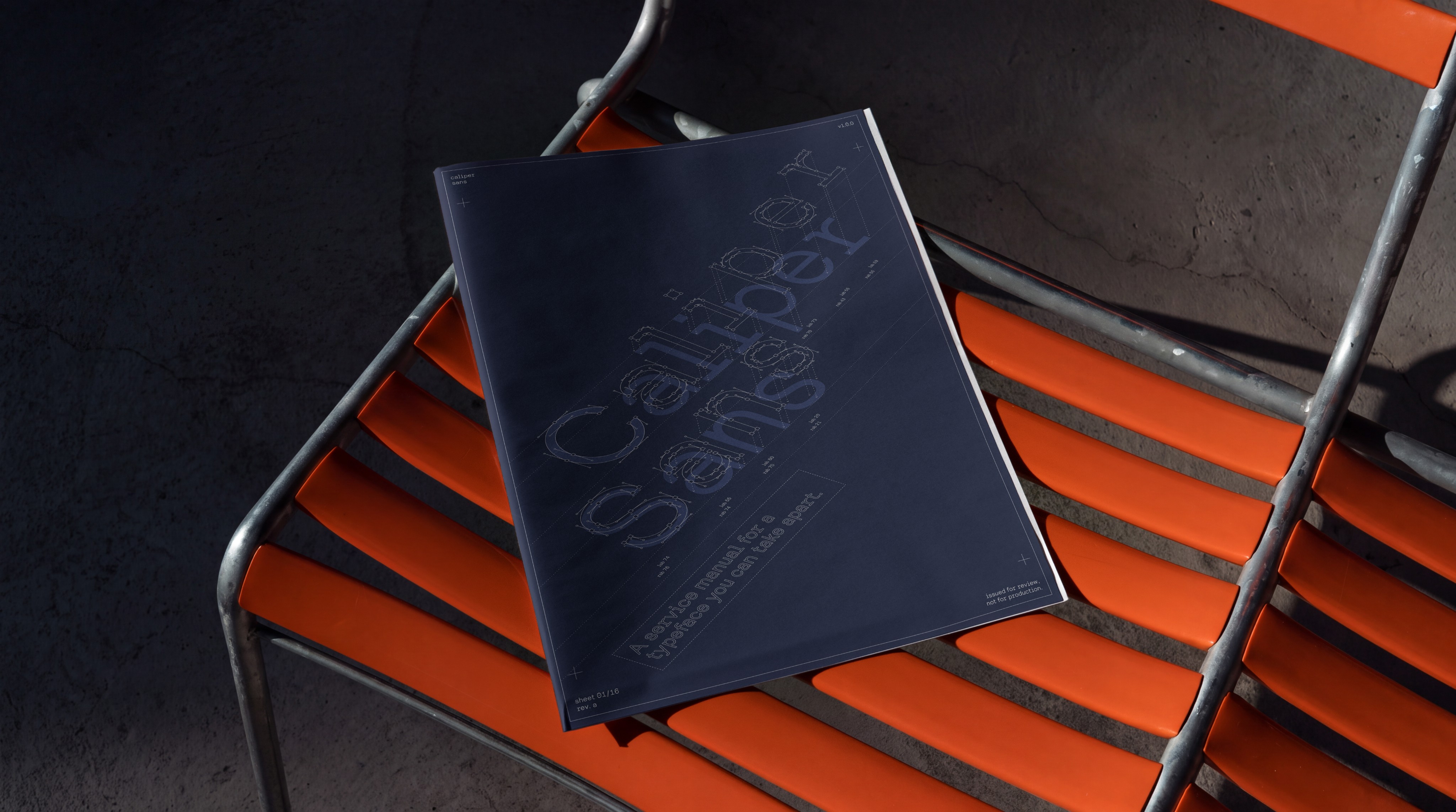
Caliper Sans is a measured, functional face, built to read small and work hard. The name carries the measured, precise feeling I wanted in the letterforms. It takes its cue from monospaced type, the look of a spec sheet or a terminal, but drops the rigidity of a true mono so it stays comfortable as body text. The result is a face that holds up at nine points in a dense table and stays warm enough to read across a full page. Built to carry information without editorializing it.
/ SCOPE
Type Design, Visual Identity
/ CREDITS
Client: Self-Initiated Proposal
Designer: Micah
/ YEAR
2026
Design